By Douglas Esser
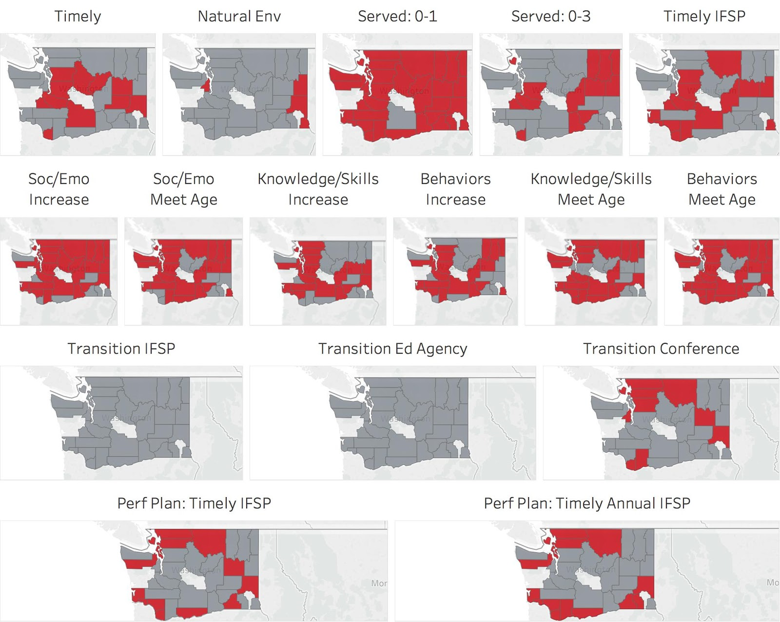
Students in Katy Cook’s data visualization course see a genuine impact with community partner WithinReach, a Seattle-based health services navigator for residents across Washington. (The series of state maps at left were created by students in the spring class to compare county data.)
“This data work can inform real 9-to-5 work,” said Stephanie Orrico, child development coordinator for WithinReach, which operates hotlines and websites and promotes family access to community resources.
In recent years, students in BIS 232 Data Visualization have given WithinReach presentations on breast-feeding, immunizations and child development. Cook’s spring class analyzed public school data sets for references to children with developmental delays or special needs.
"This Washington-focused analysis shed light on how service delivery varies geographically in our early intervention system and in our public schools’ special education system.” Orrico said.
“Whether our WithinReach staff are preparing a family to navigate these systems, or whether we are interacting with state partners to improve how these systems work, these insights can focus our efforts and maximize our impact,” said Orrico. “Working with Katy’s class has been a wonderful experience. She is a thoughtful partner, and she models meaningful collaboration for her students.”
Cook, left, a lecturer in the School of Interdisciplinary Arts & Sciences, had been a volunteer at WithinReach. She began involving classes about four years ago. In addition, she operates the consulting business BigRedAbacus, which mostly serves nonprofits. Slogan: “We do data for do-gooders.”

“Data visualization is getting the expert’s brain on paper. It lets the nonexpert have access to that information more easily, so we can have more productive discussions and make better decisions,” said Cook.
The popular class is part of the mathematical thinking and visualization major, but it attracts students from almost any major because the tools are so valuable – representing statistics or geographical information in graphs, maps or charts using Microsoft Excel or Tableau software.
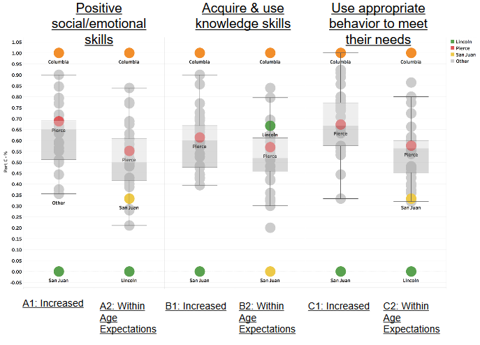
The WithinReach partnership gives students a real audience for their work. “They’re getting to present to experts in their field. It’s really powerful for the students,” said Cook. The box plot at left was created by students in the spring class to rank counties.
WithinReach also immerses students in health topics that are new to many.
“It is exciting to see them confidently using relevant vocabulary and asking questions that reflect a strong understanding of the systems they are examining,” said Orrico.
One student in the spring class, Leah Shin, said regular feedback from WithinReach gave students confidence when they made their final presentation to the organization.

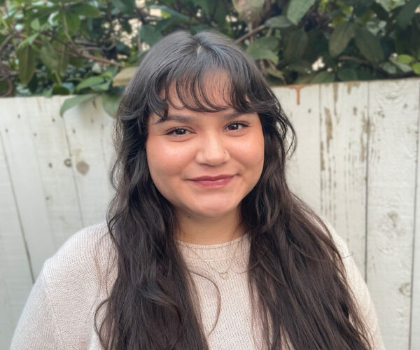
Shin, right, immediately put her data visualization skills to work at in a summer internship in product management at T-Mobile. It involves working with the wireless carrier’s coverage map of the United States to showcase data for customers, T-Mobile retail stores and customer service.
“I’ve implemented a lot of what I learned,” said Shin, who also is the vice president for the Associated
Students of the University of Washington Bothell. She expects the concepts will help complete degrees in interactive media design and business marketing and graduate in 2019.
“I’m very glad I took that class,” Shin said. “It’s a really strong skillset to have.”